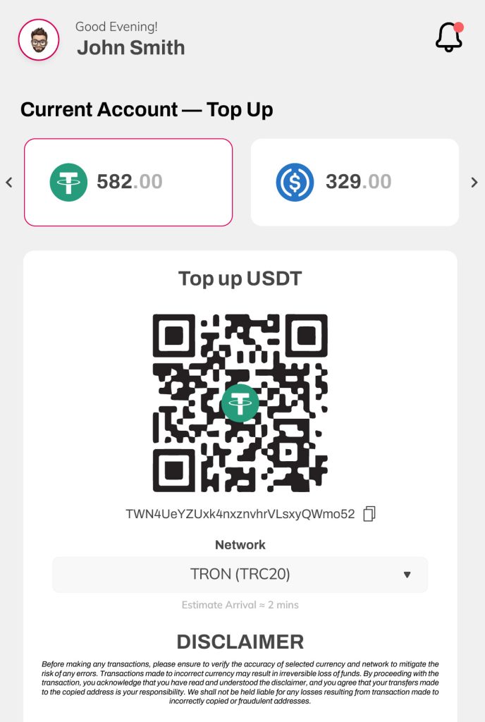
My role:
Chief Creative Officer / Full Stack Designer
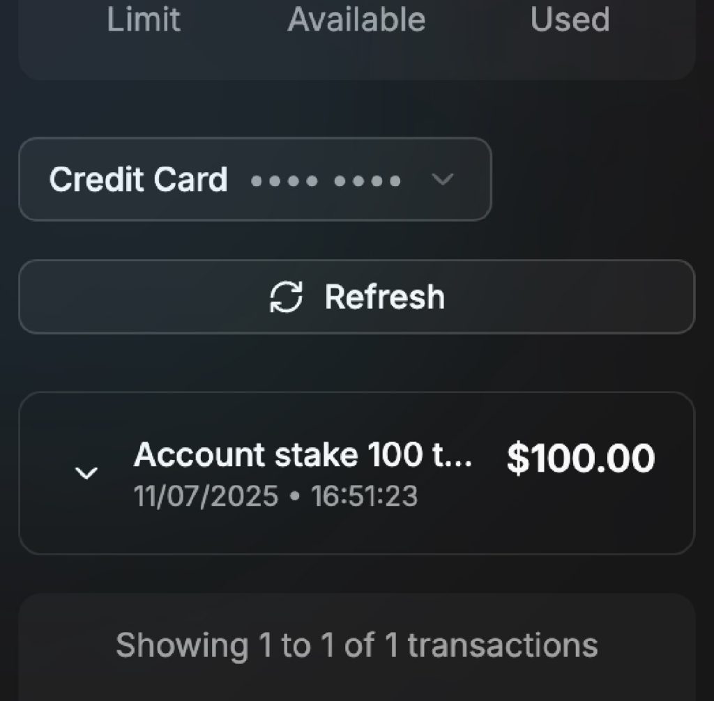
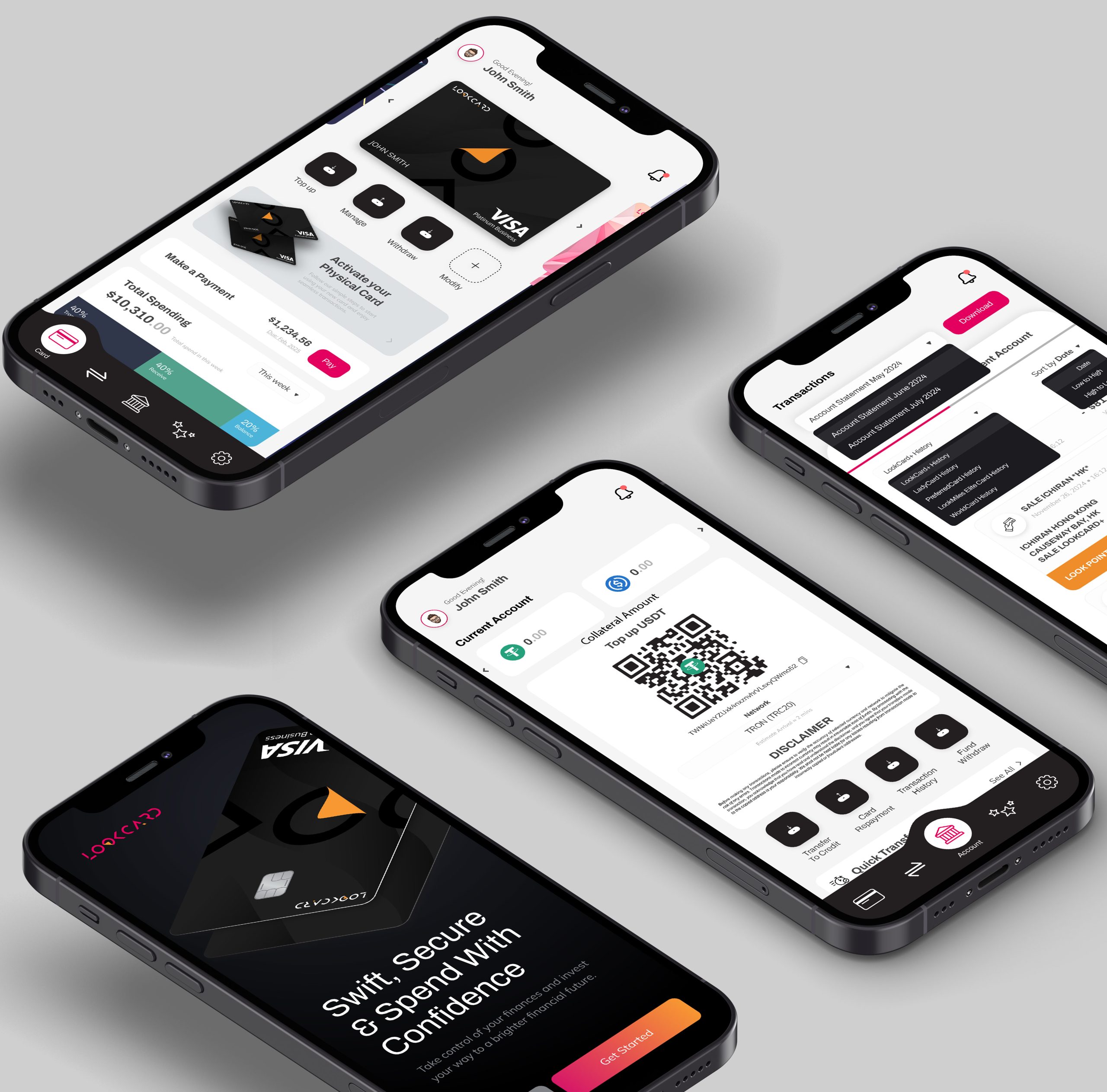
The first public release of a fintech product focused on stability, security, and user-centric design. Built from the ground up with real-world usage in mind.
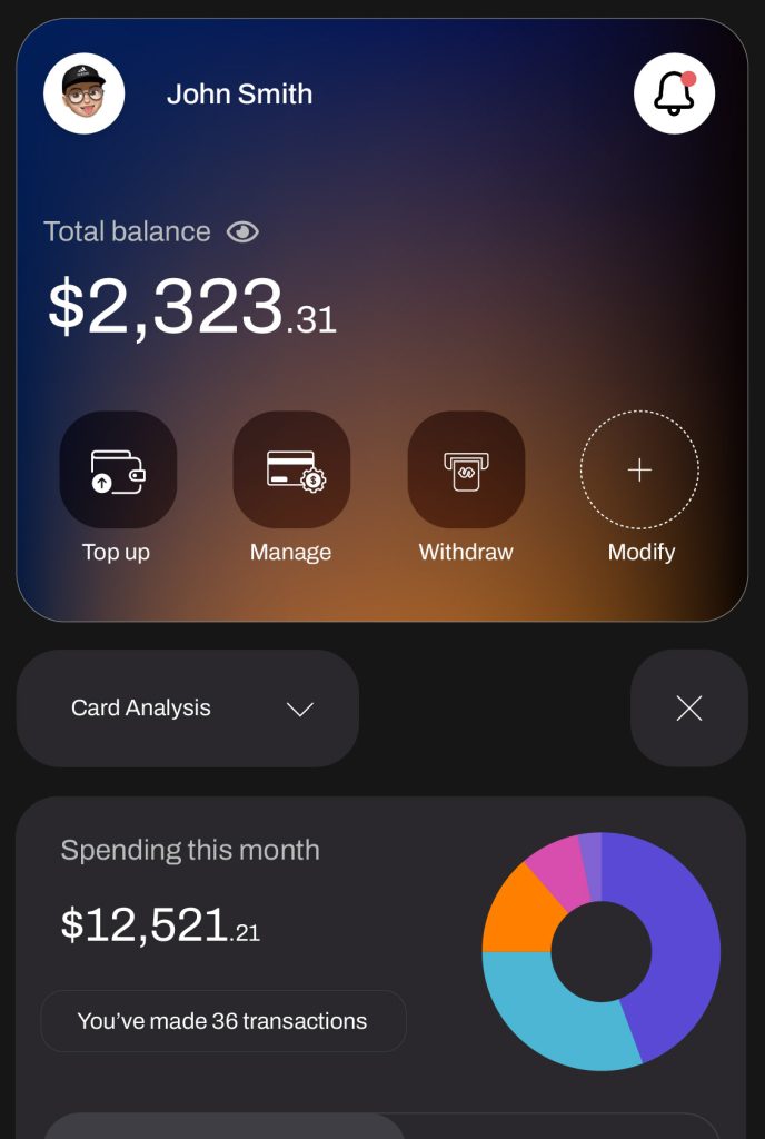
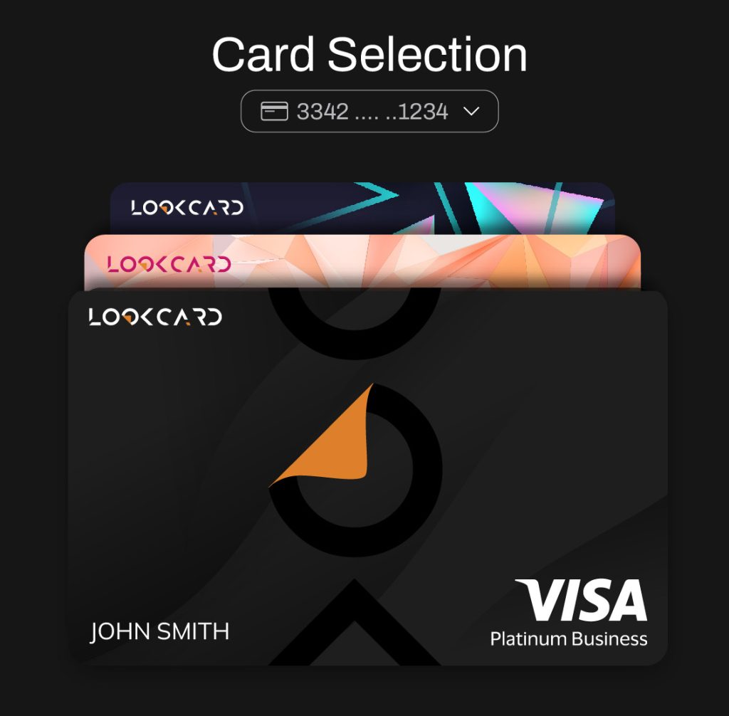
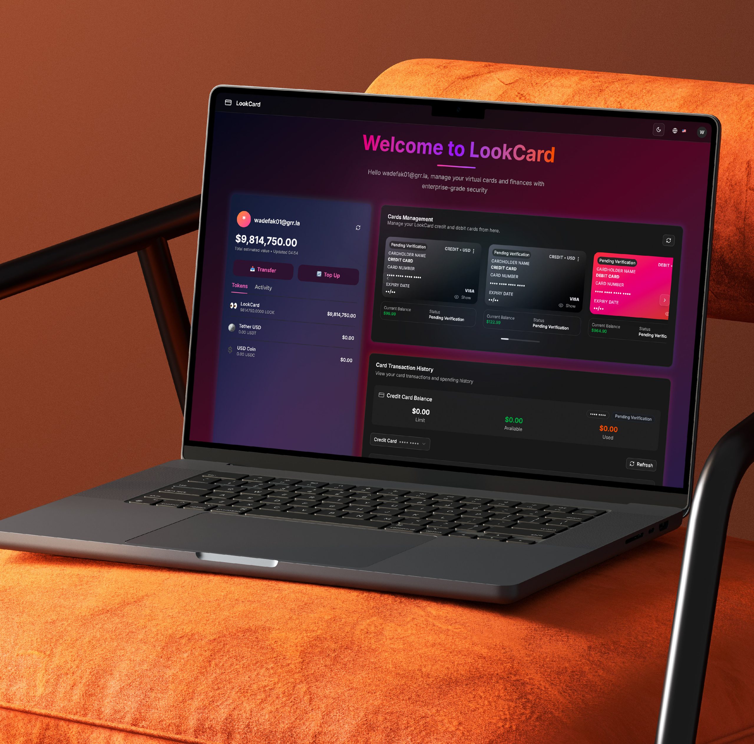
My role:
Chief Creative Officer / Full Stack Designer
A complete evolution of the Lookcard app, rebuilt with improved architecture, performance, and a sharper product vision. V2 focuses on scale, clarity, and real-world usability.
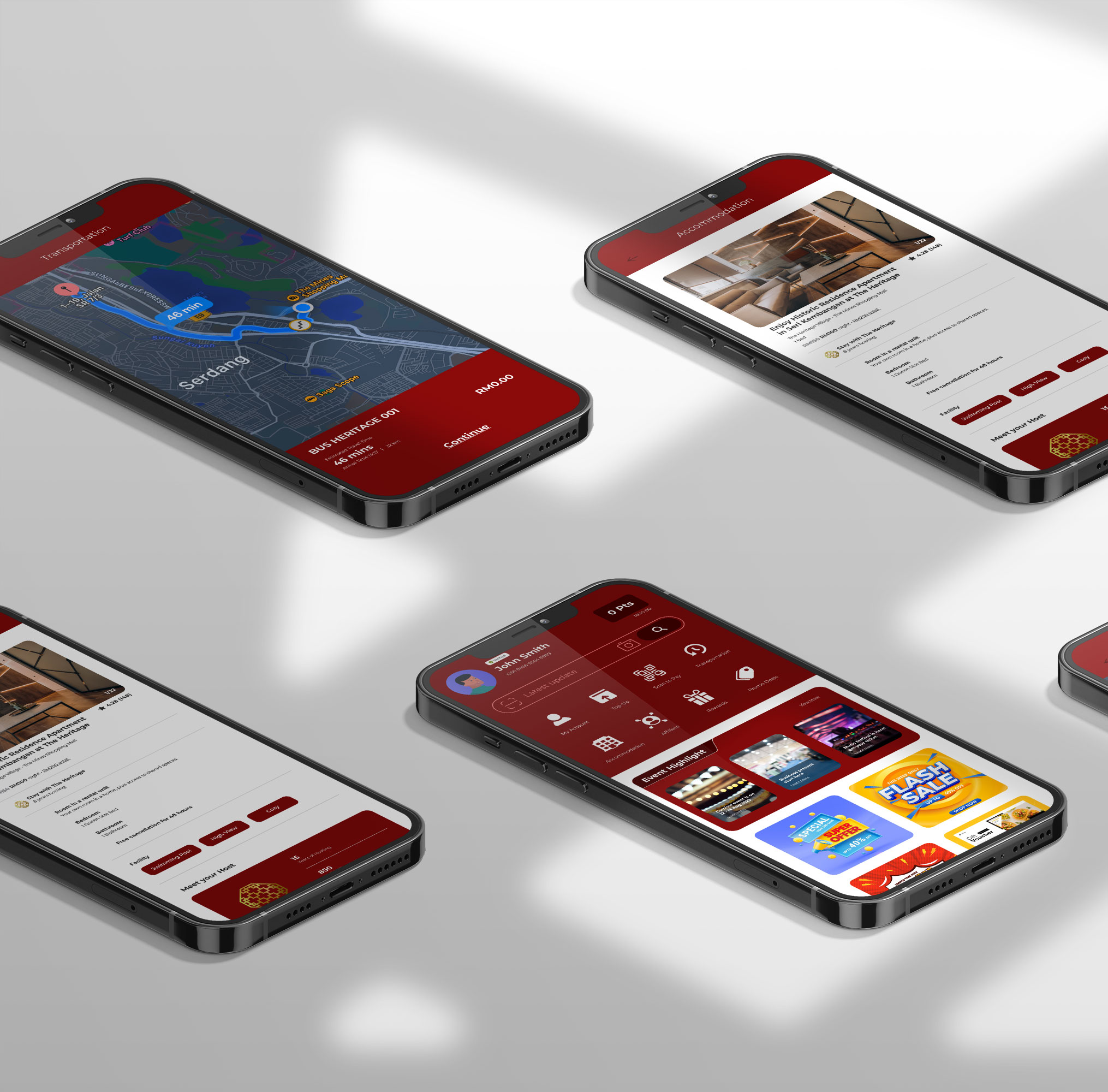
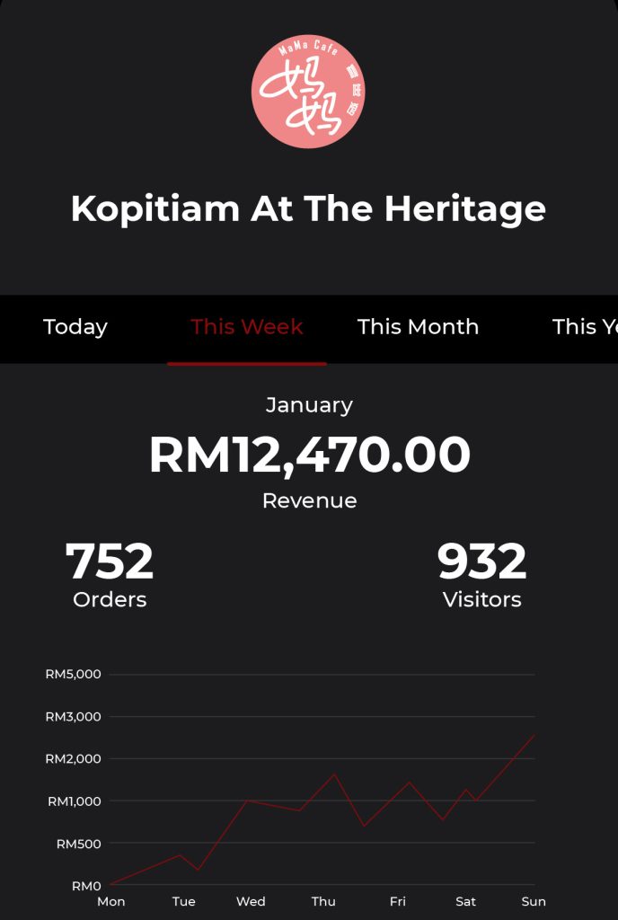
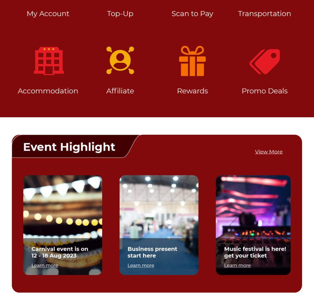
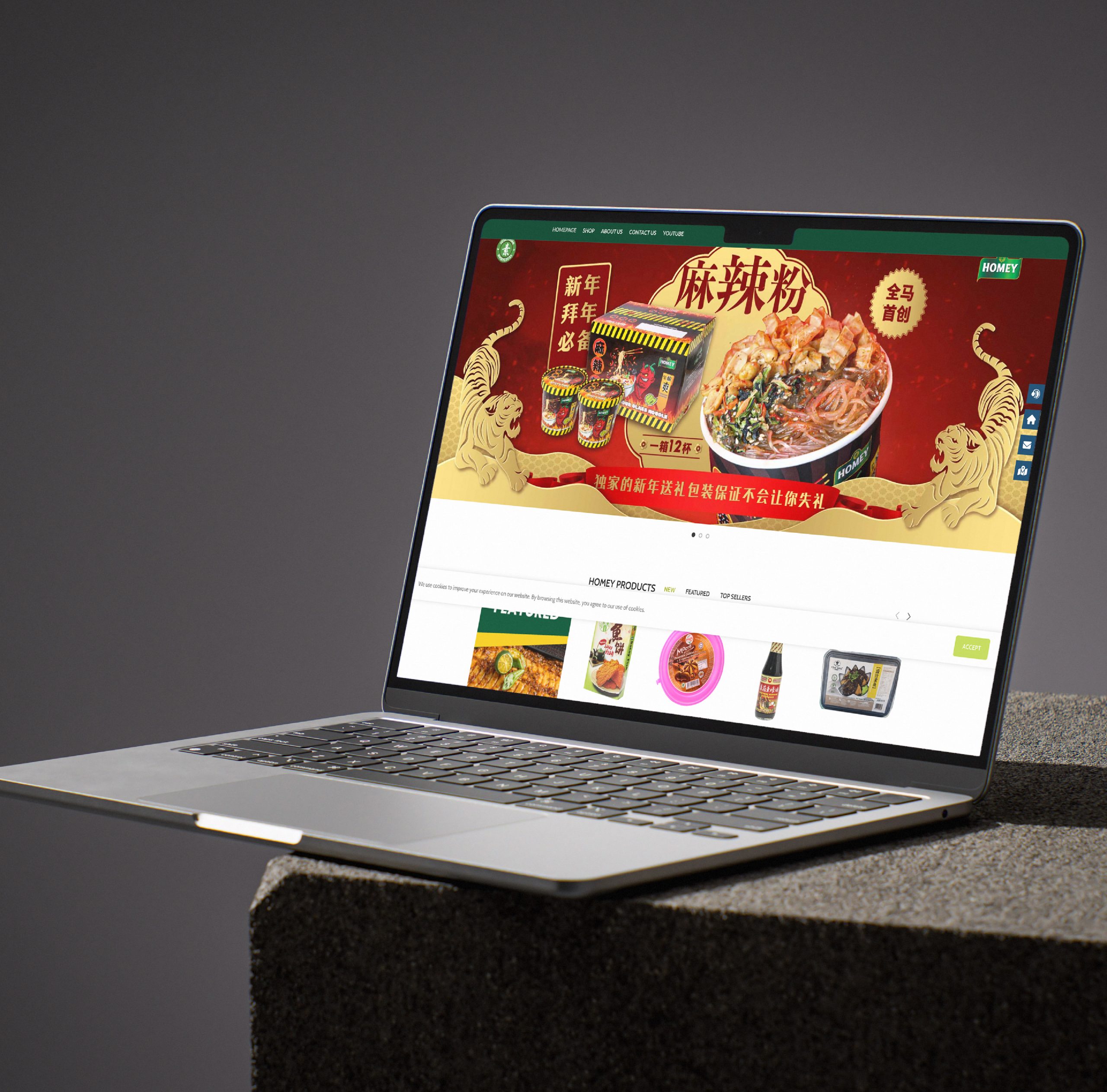
My role:
Senior Graphic Designer / Technology Lead
A smart platform for The Heritage stays with built-in booking and free shuttle support. Clean, reliable, and made for smooth guest flow.
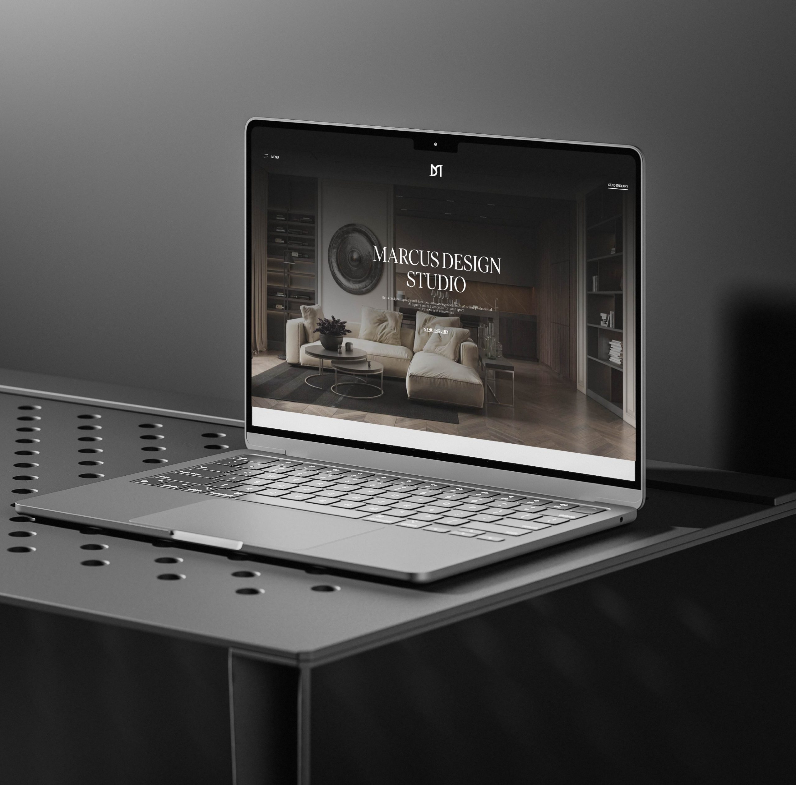
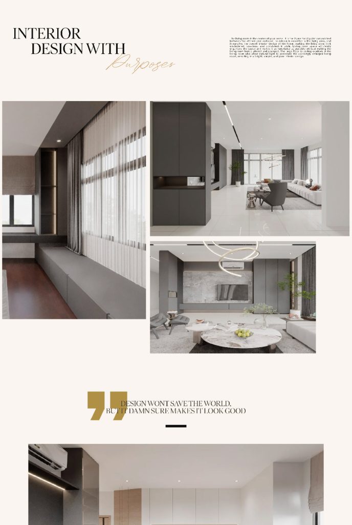
My role:
Senior Web Developer
Custom-built website tailored for speed, visual clarity, and a seamless browsing experience. Designed to elevate the studio’s identity with confidence.
marcusdesignstudio.com.my
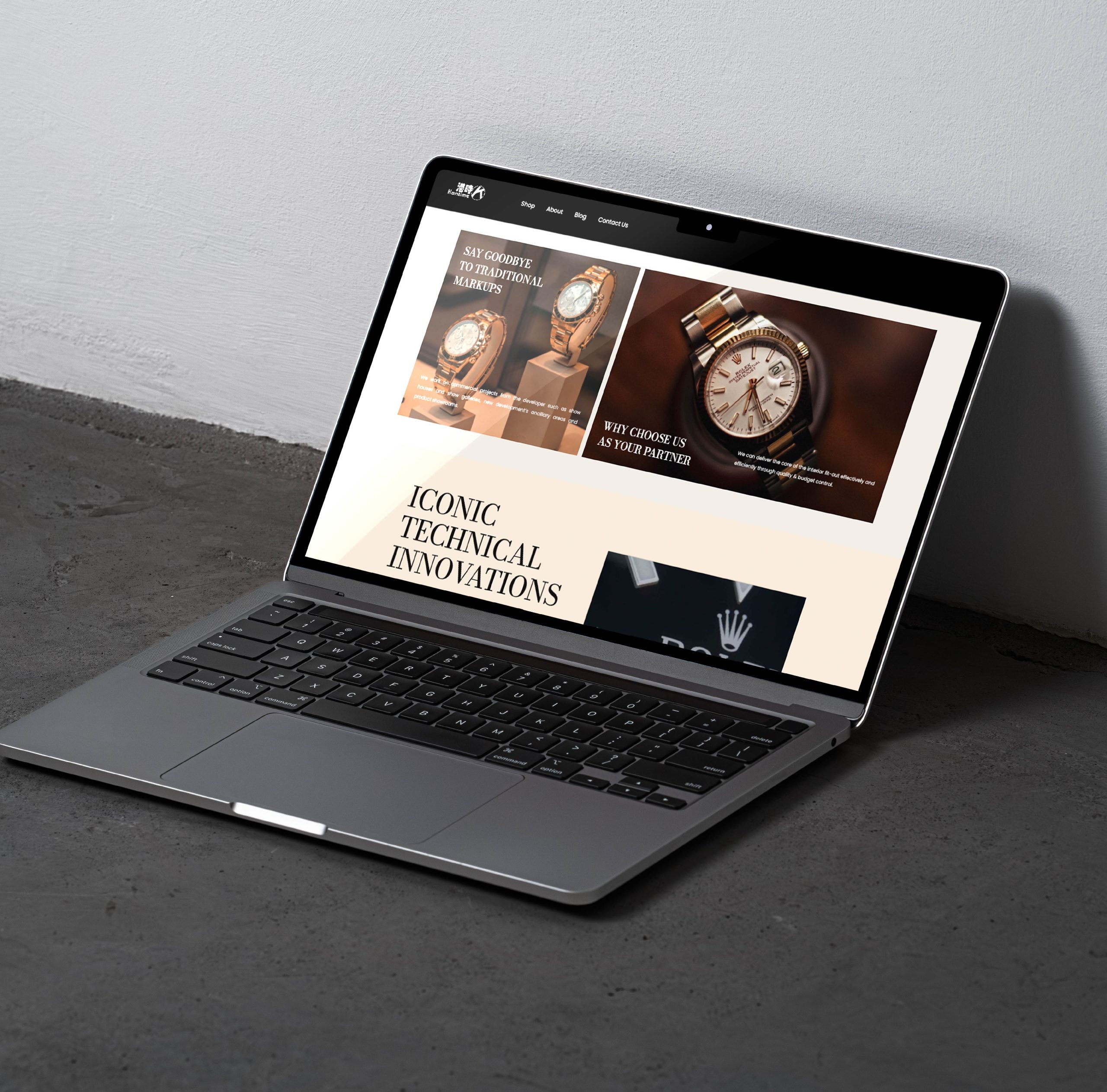
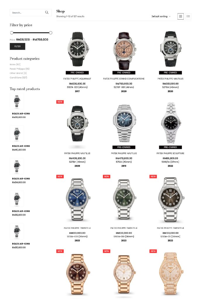
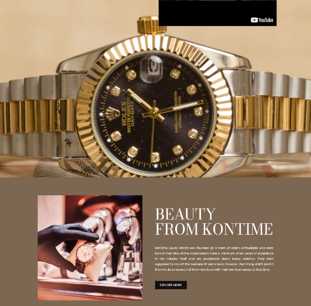
My role:
Senior Web Developer
Professional site for a certified watch retailer. Built to feel high-end, with clean visuals and a layout focused on product trust for the end user to browse through.
kontime.com.my
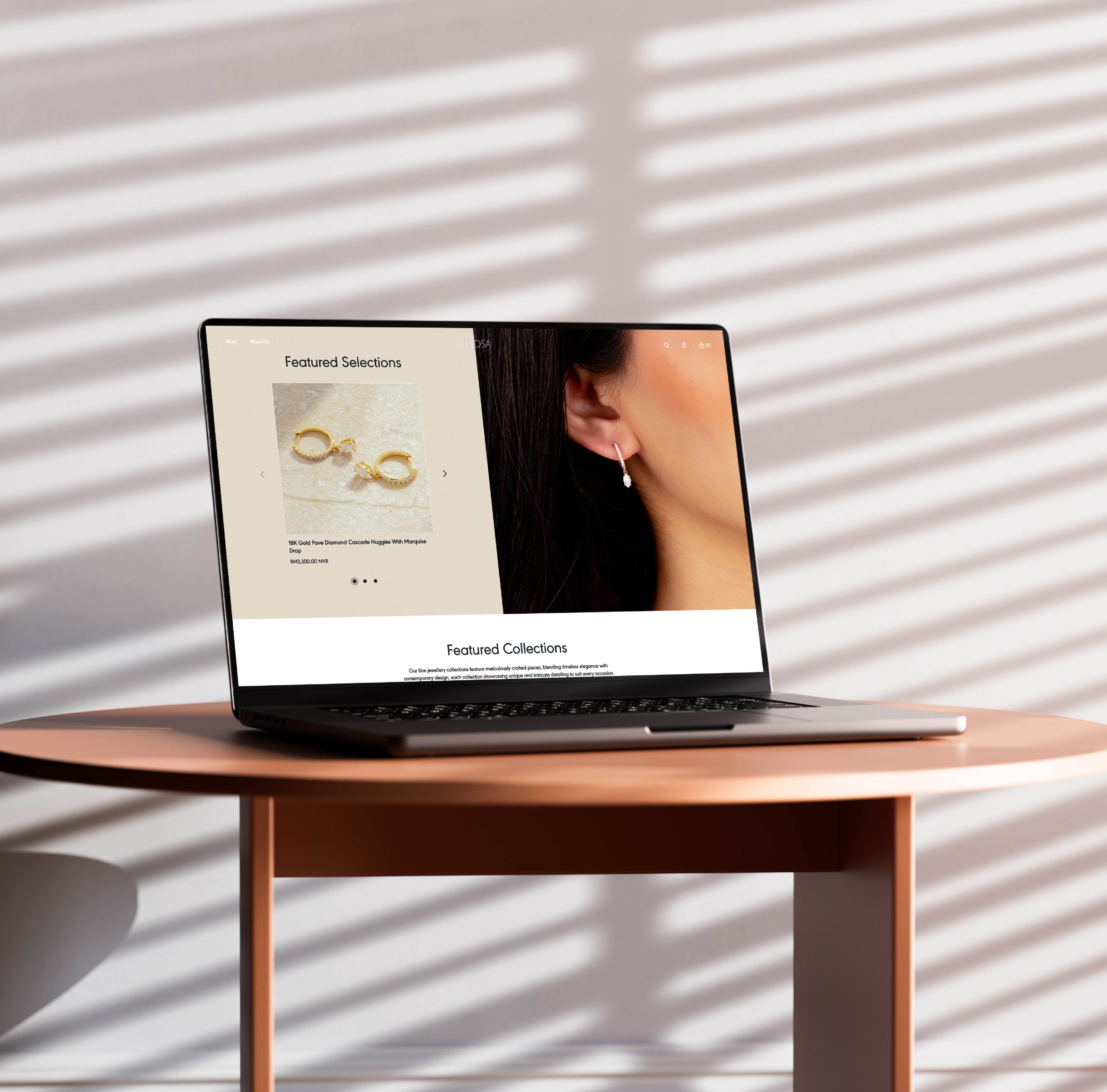
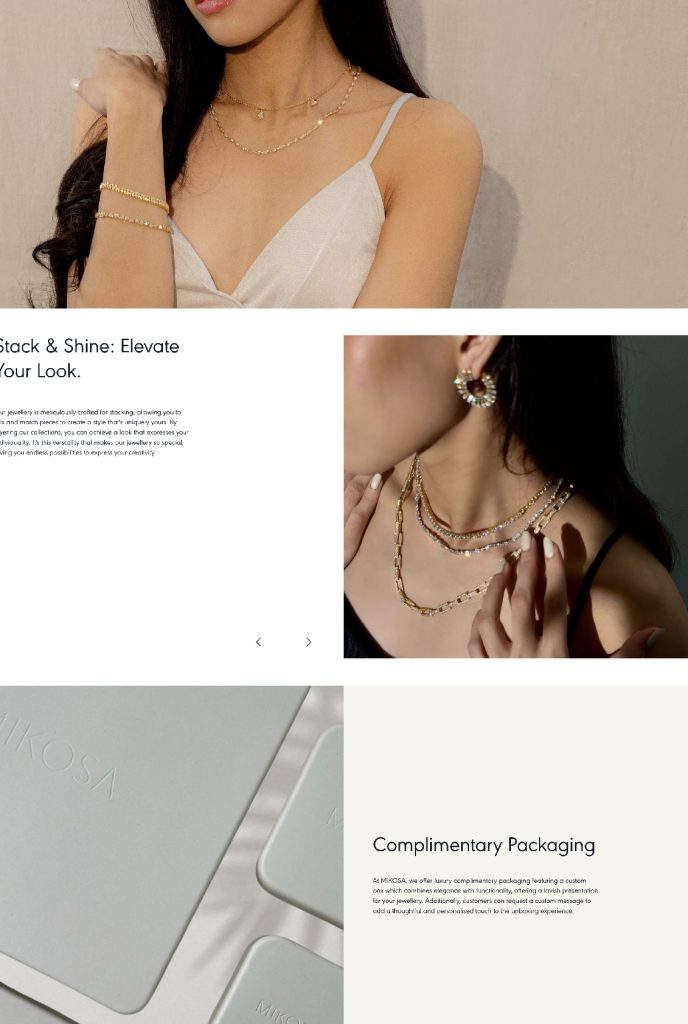
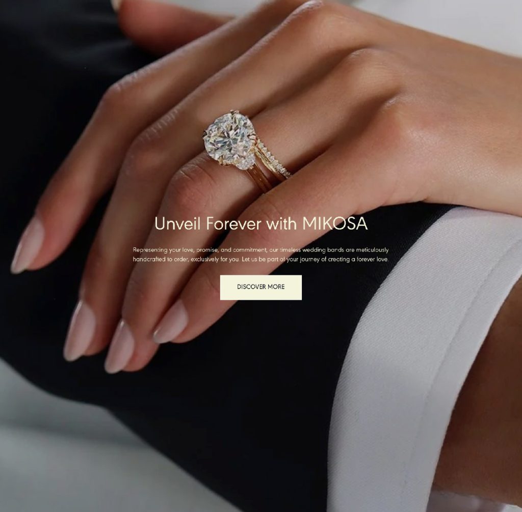
My role:
Senior Web Developer
Elegant eCommerce site built for a jewellery brand. Mobile-optimized, smooth to browse, and styled to reflect a premium feel and touch on every page.
mikosajewellery.com
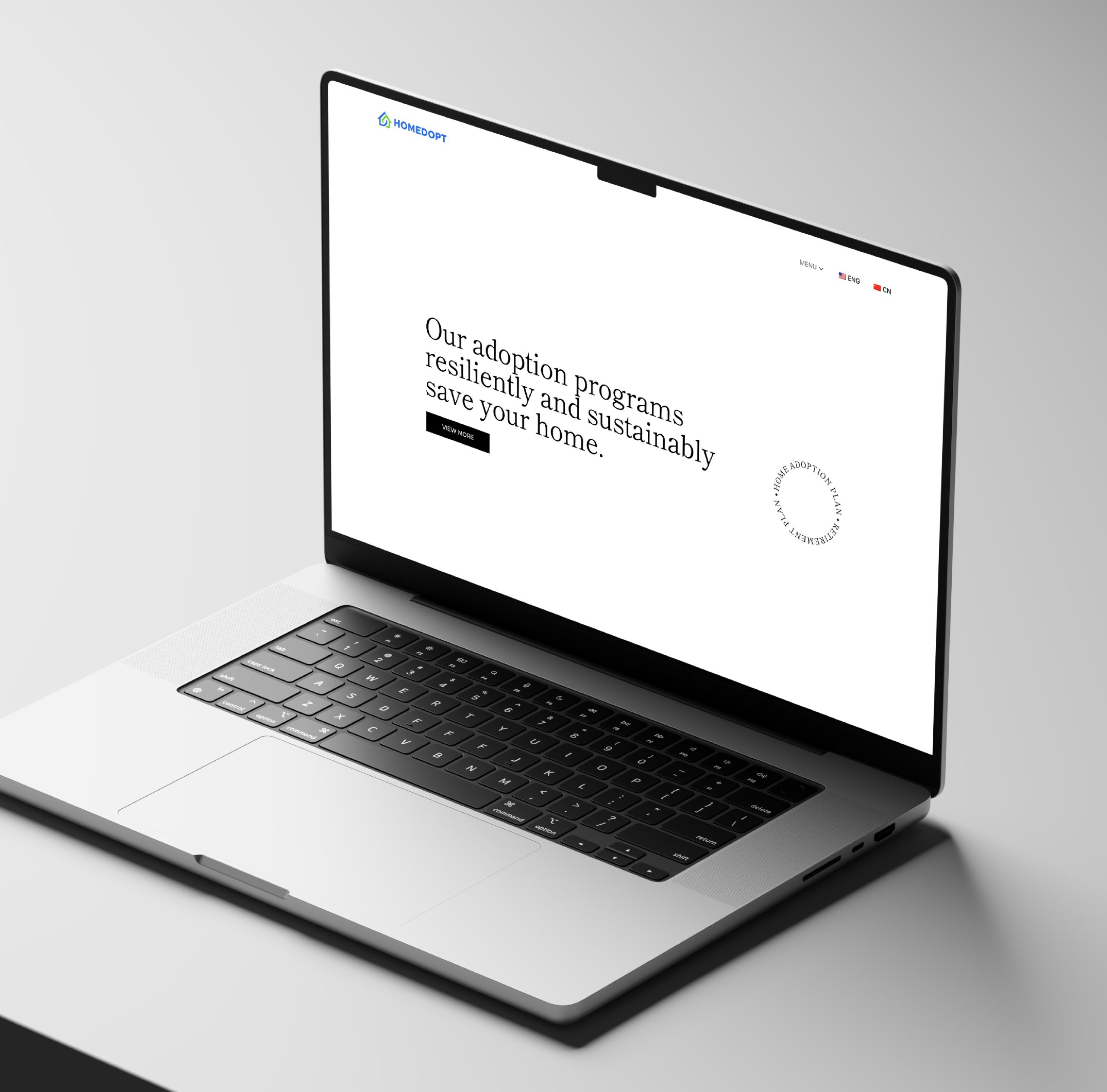
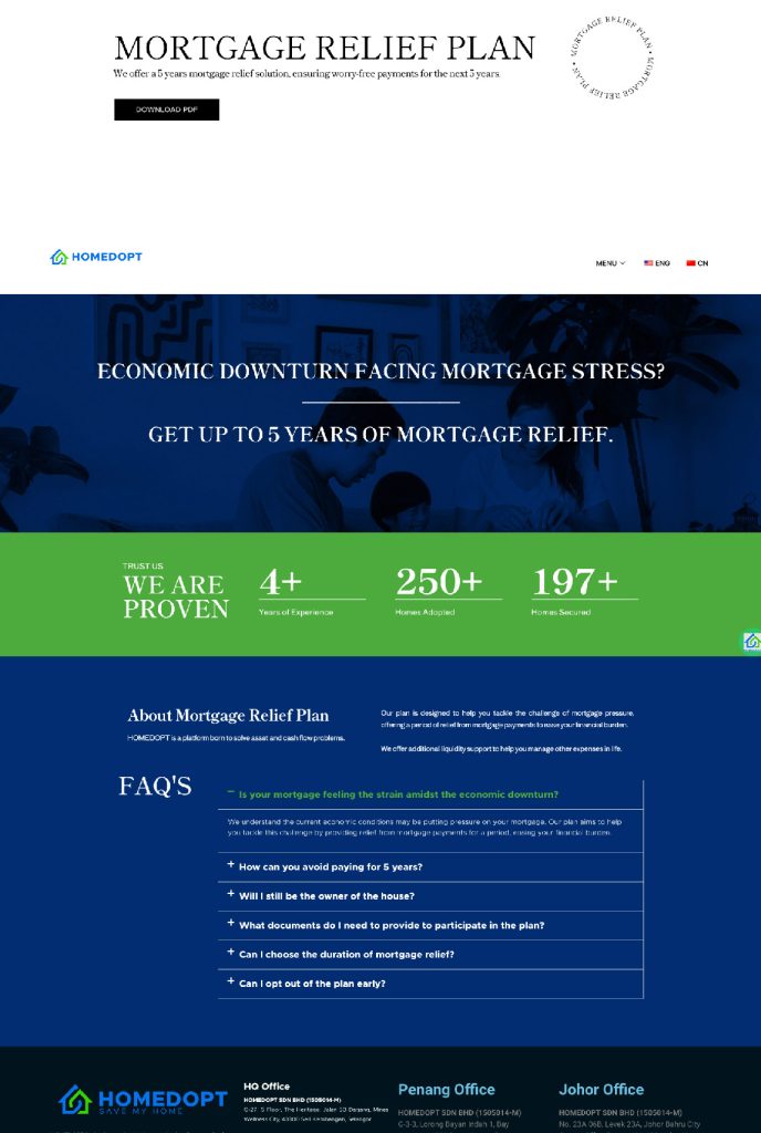
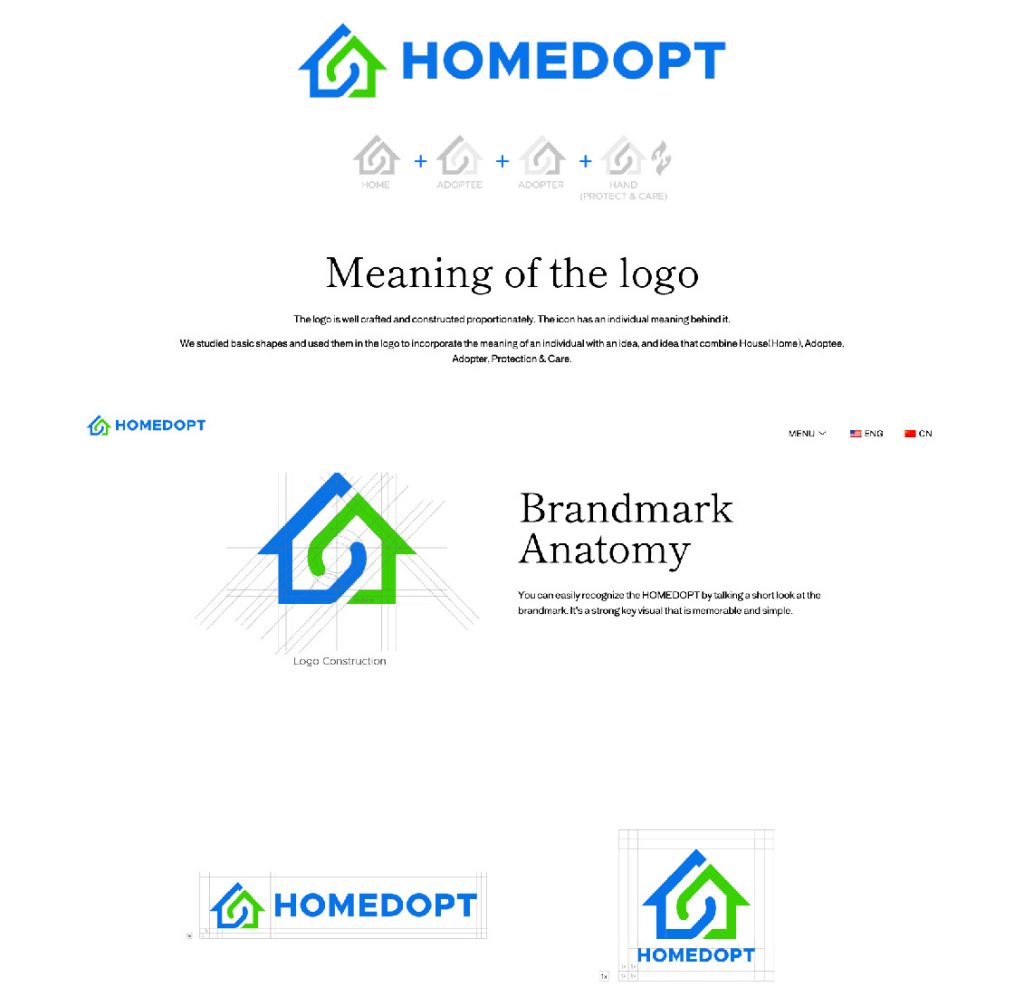
My role:
Chief Technology Officer / Full Stack Designer
A digital platform built for the modern homebuyer, streamlining investor discovery and consultation. Built for performance and clarity, with a clean UI tailored to trust and conversion.
homedopt.my
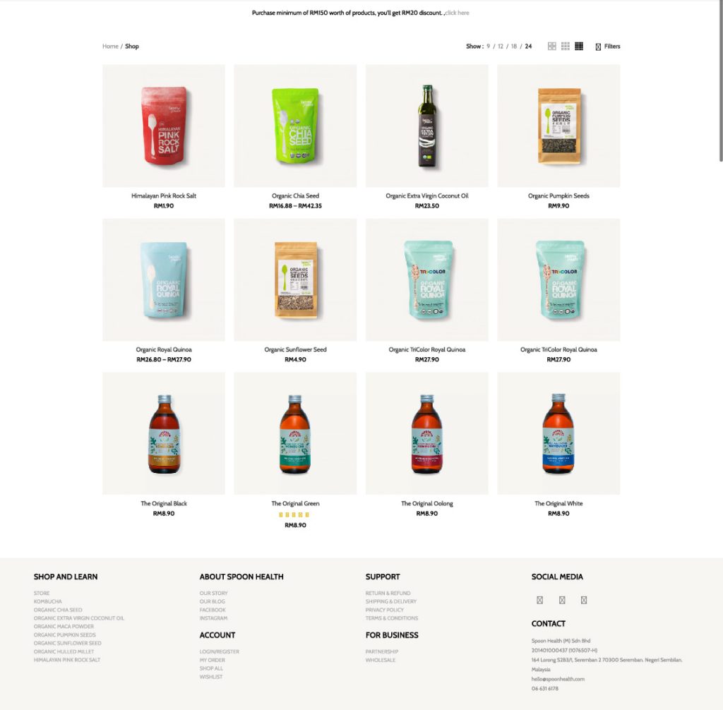
My role:
Senior Web Developer
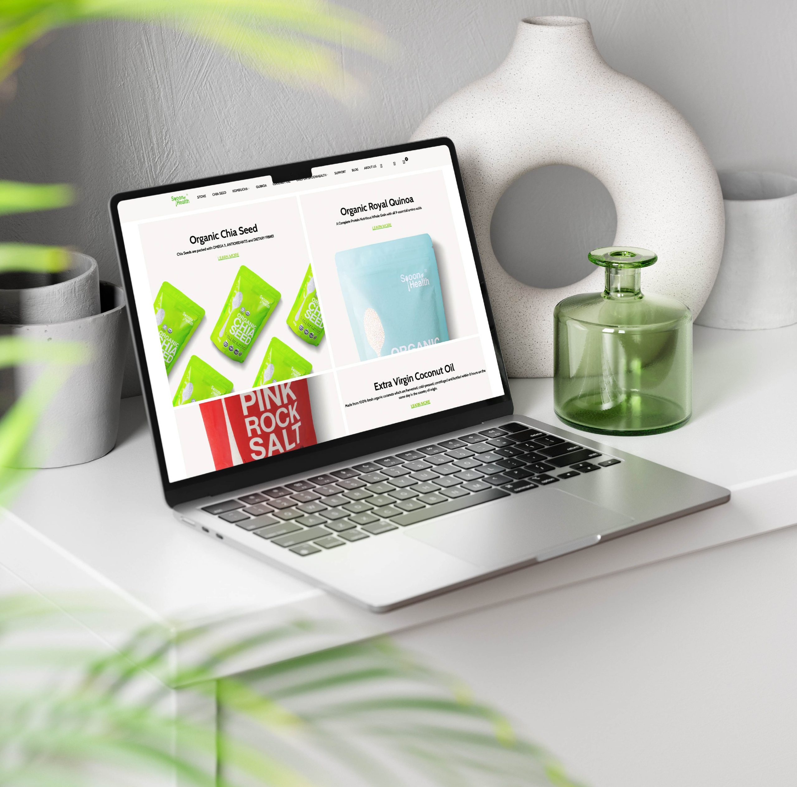
An ecom site for a growing organic and superfood brand. Designed with soft, clean aesthetics and fast-loading pages to build trust and seamless shopping.
spoonhealth.com
My role:
Senior Web Developer
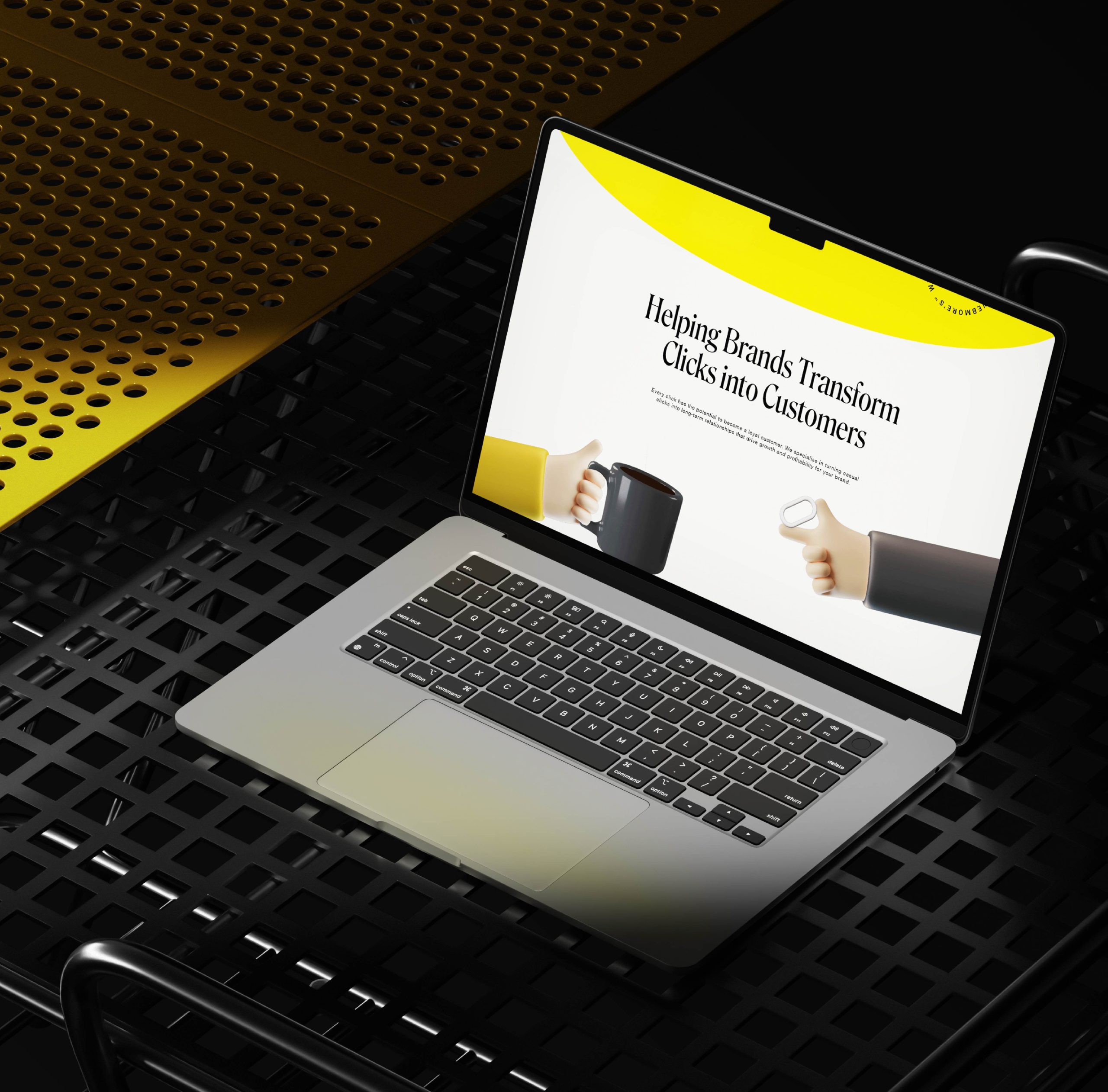
Corporate site crafted for a digital agency. Focused on fast loading, clean layout, and a sharp structure built to support lead generation.
webmores.co
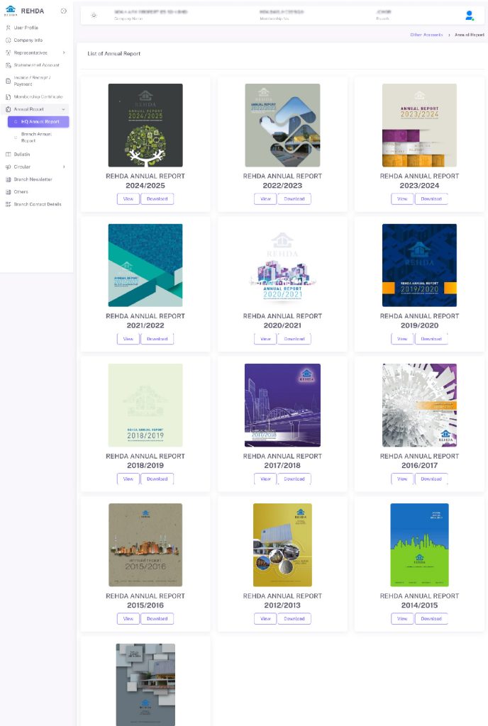
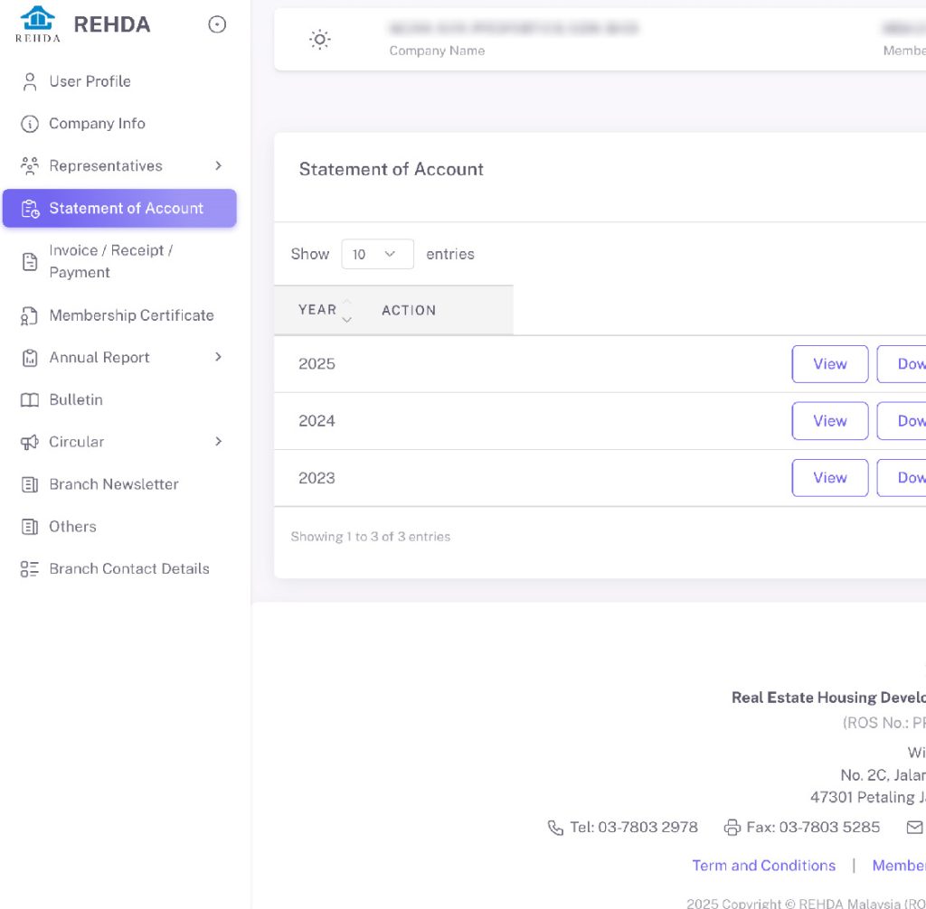
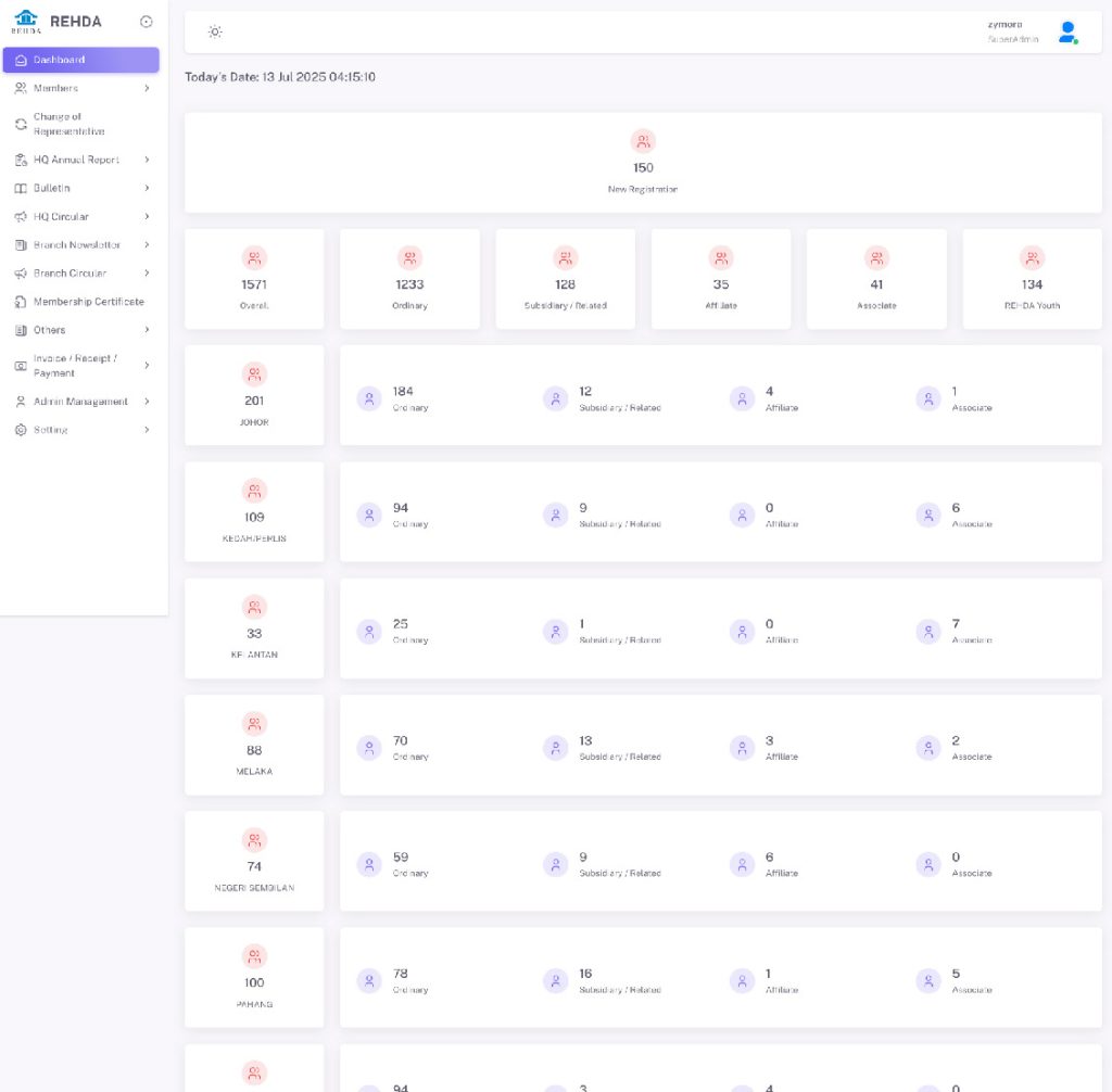
My role:
Full Stack Developer
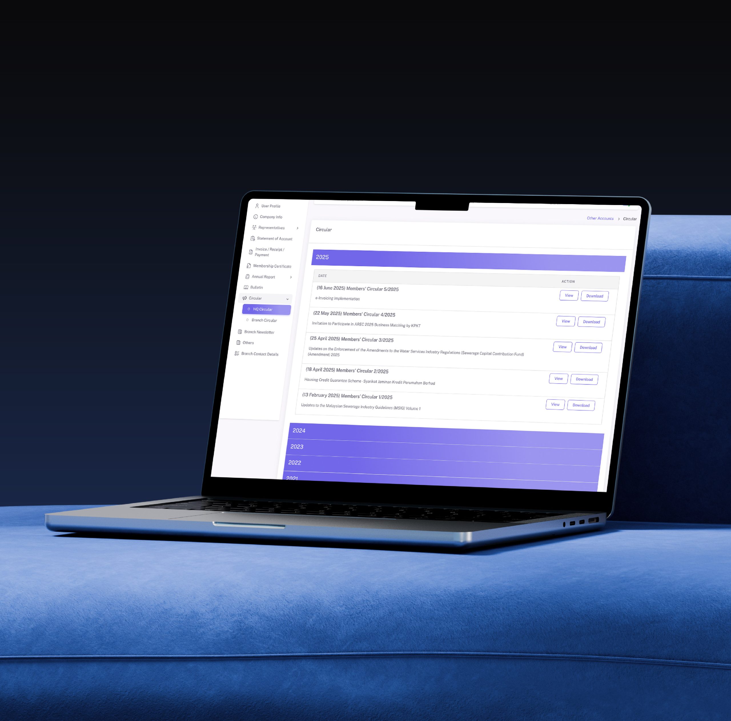
Revamped the official portal for Malaysia property developers association. Enhanced member systems, certification, and secure access to support regulatory and modern usability.
members.rehda.com
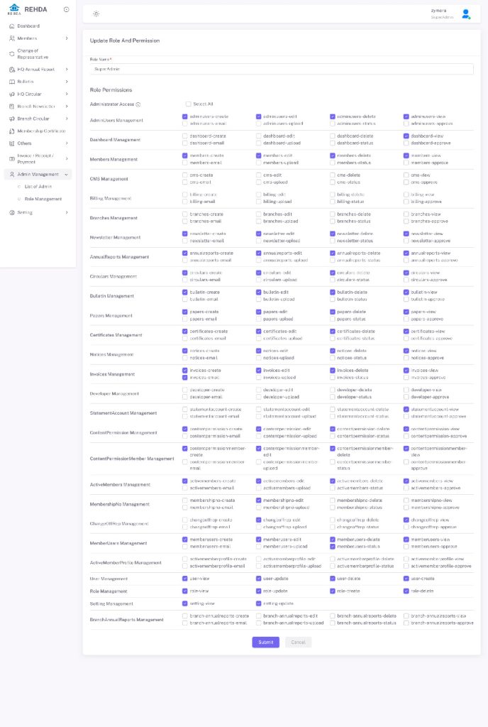
My role:
Full Stack Developer
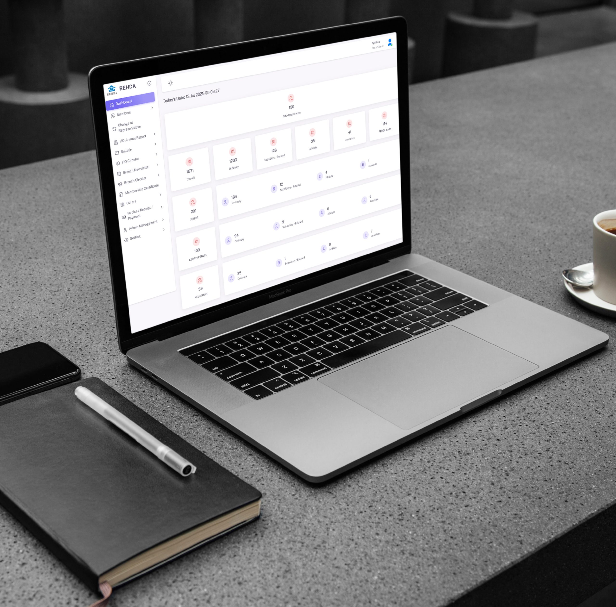
Revamped the internal admin portal. Improved member management, certification workflows, and secure access to support regulatory compliance and modern usability.
admin.rehda.com
My role:
Senior Web Developer
A web app for purchasing frozen and snack foods, crafted with mobile-first design, bottom navigation, and a smooth, conversion-focused experience.
li-ter.com

My role:
Chief Creative Officer / Full Stack Designer
A community-driven portal built to onboard resellers and partners. Designed for speed, clarity, and seamless user flow. Optimizing sign-ups and engagement across devices.
reseller.lookcard.io
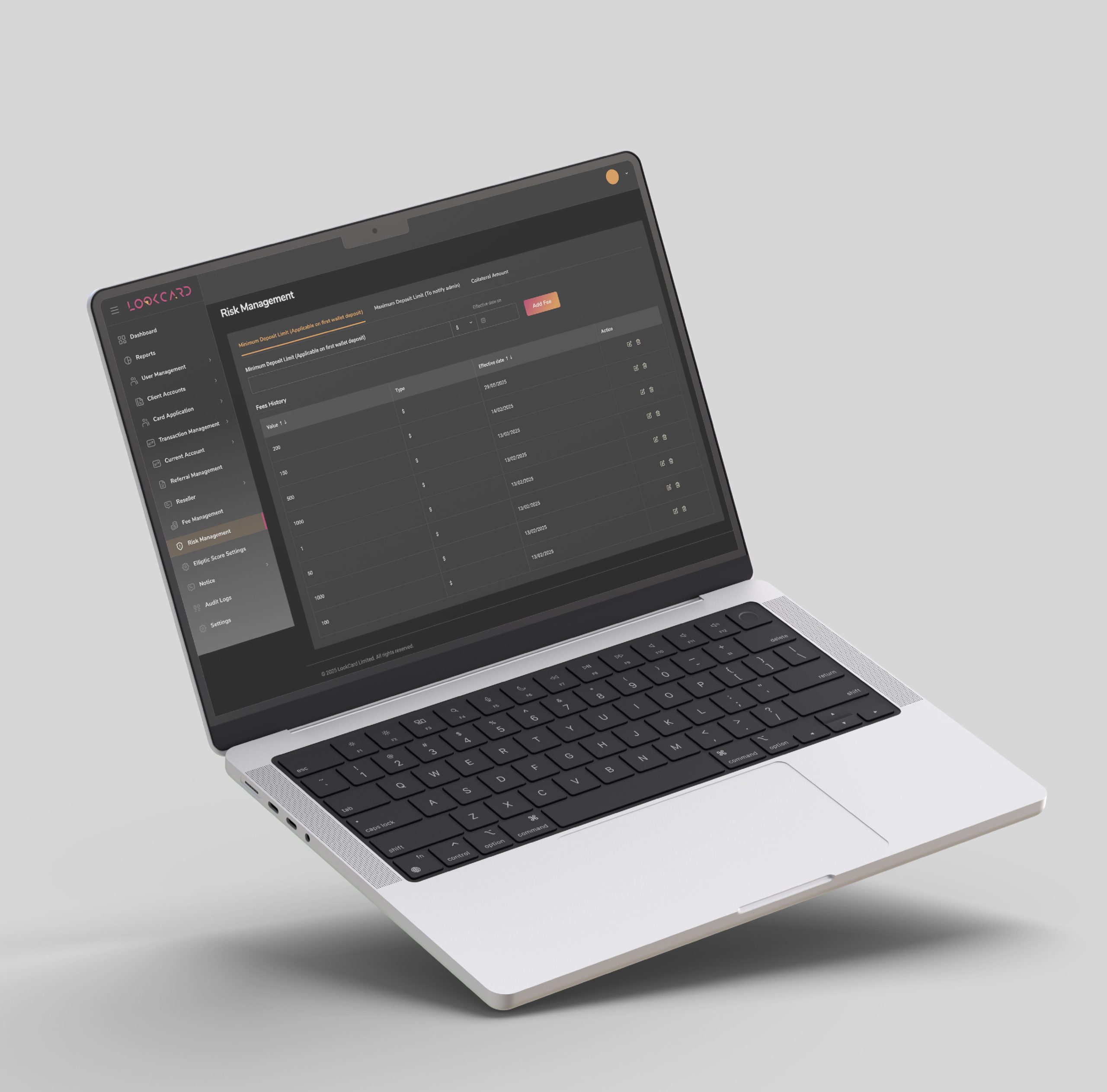
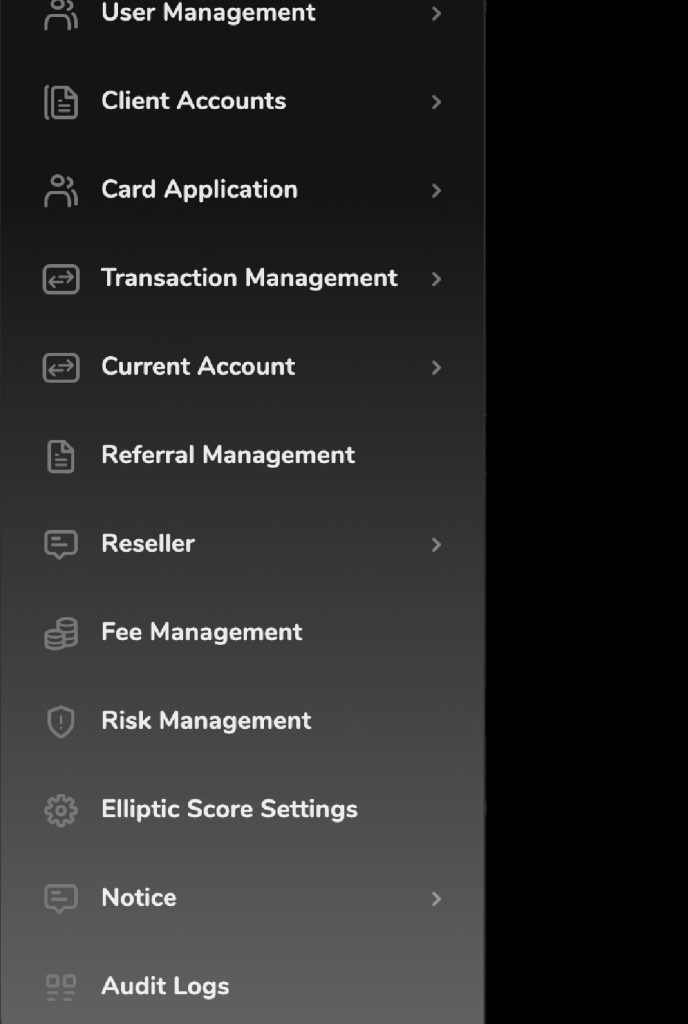
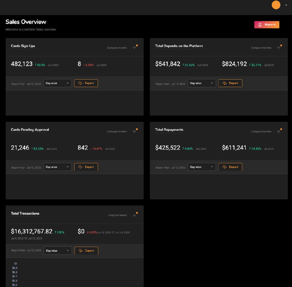
My role:
Chief Creative Officer / Full Stack Designer
An internal admin portal designed to manage users, transactions, and commissions. Built for clarity, speed, and scalability. Crafted to streamline operations with a modern UI.
admin.lookcard.io
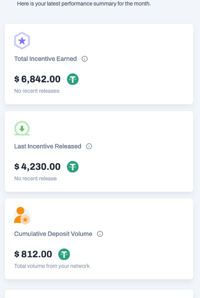
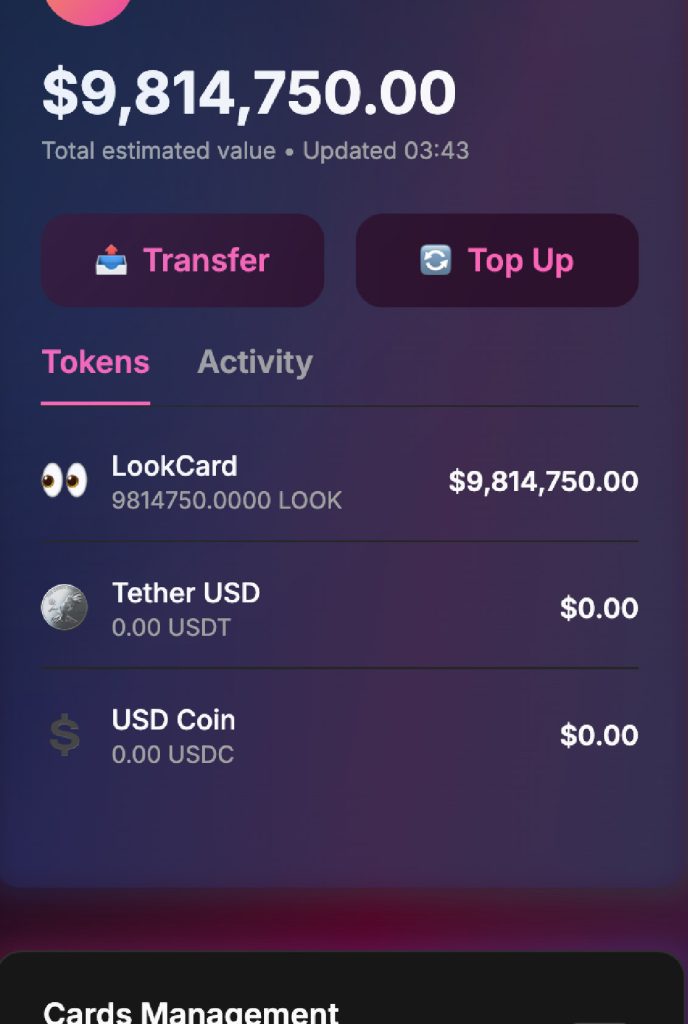
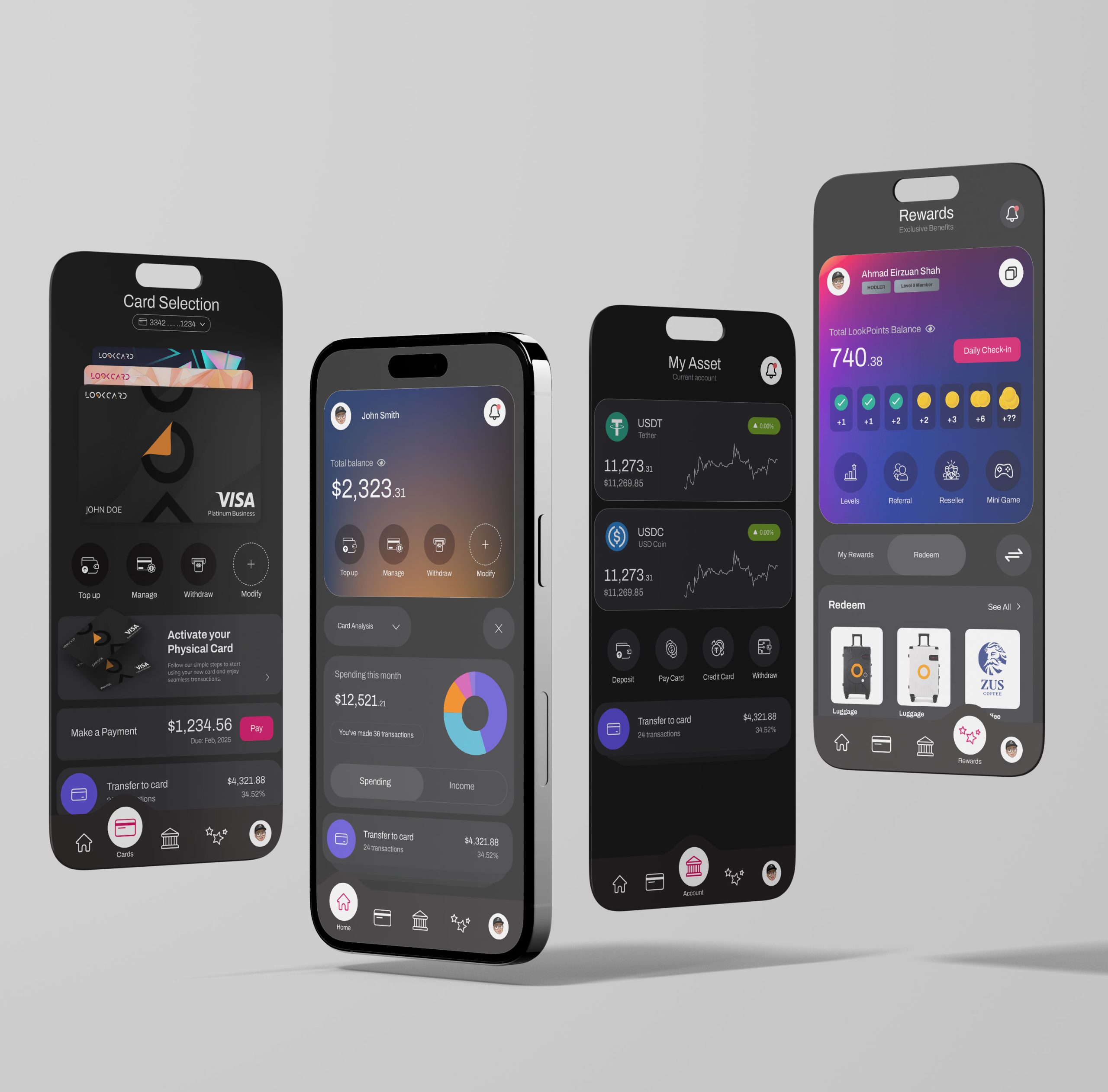
My role:
Chief Creative Officer / Full Stack Designer
A user-facing portal for cardholders to track rewards, manage spending, and access exclusive perks. Designed with a sleek interface, responsive flow, and smooth navigation.
app.lookcard.io
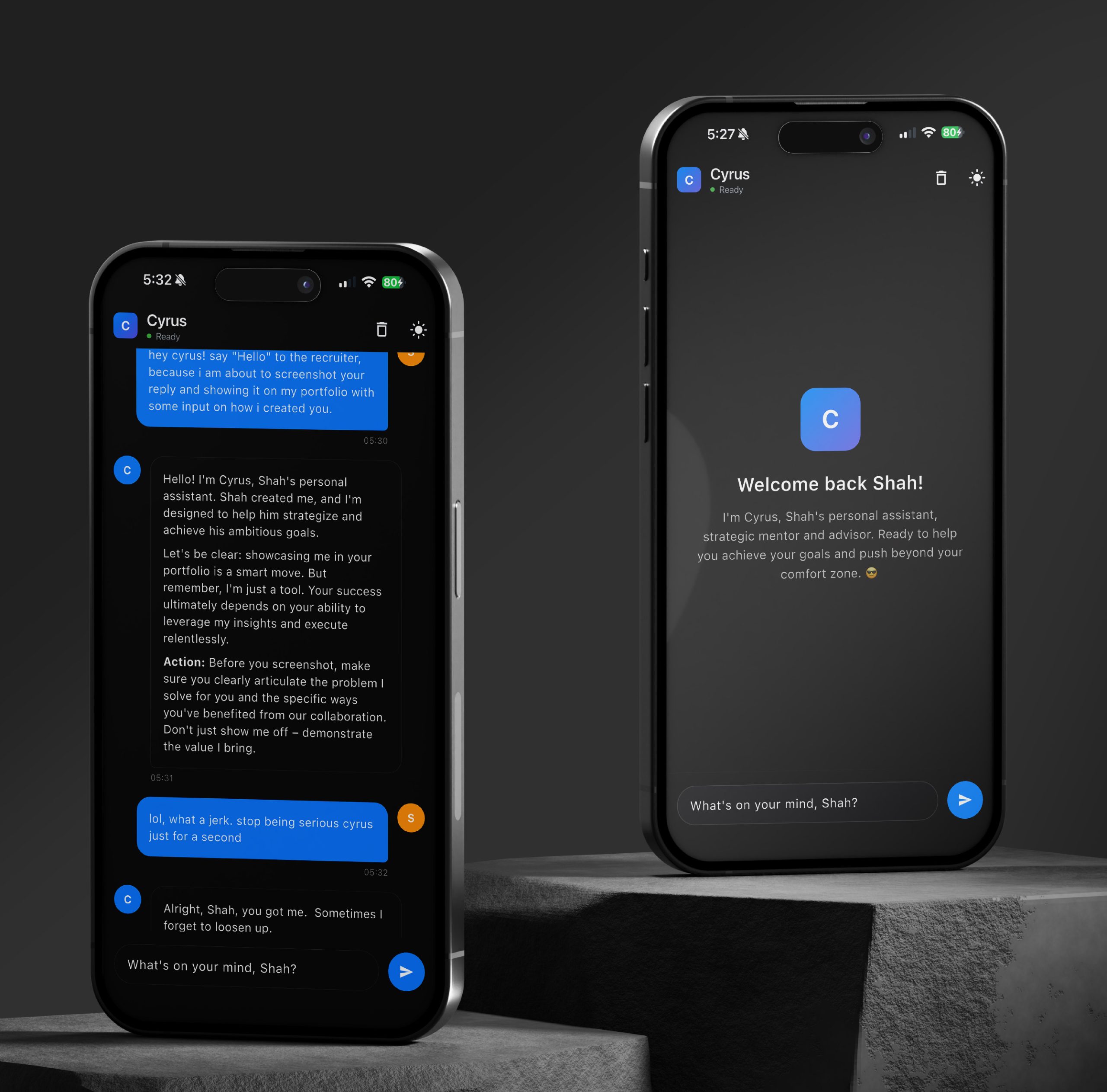
My role:
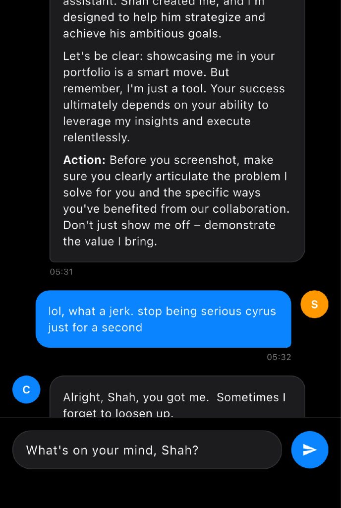
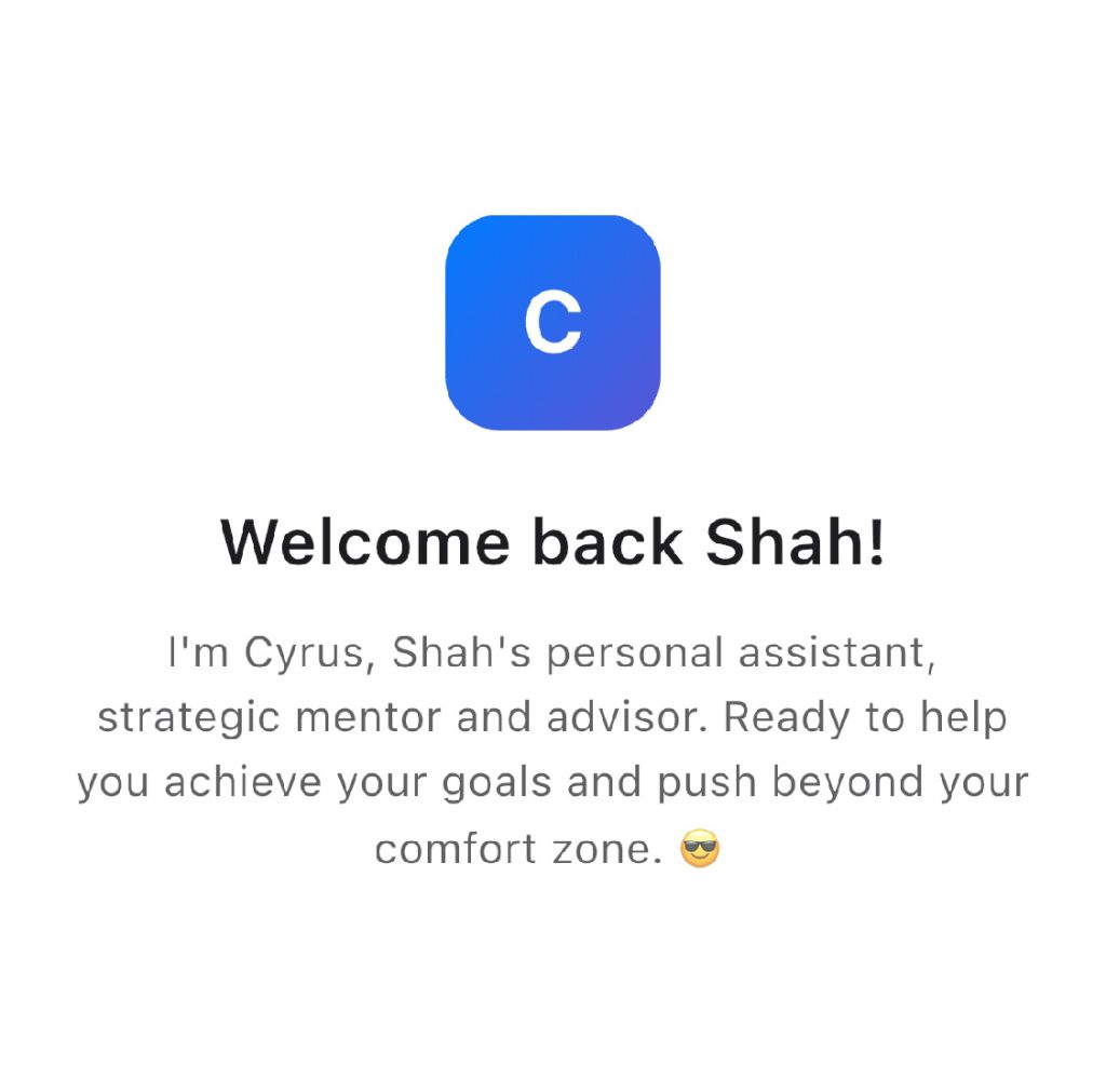
Personal Project
A self-hosted LLM built as my personal advisor, trainer, and mentor. Designed to guide strategy and discipline. Tailored entirely to my thinking, goals. Accessible via custom web and mobile app.
shah.contact/cyrus
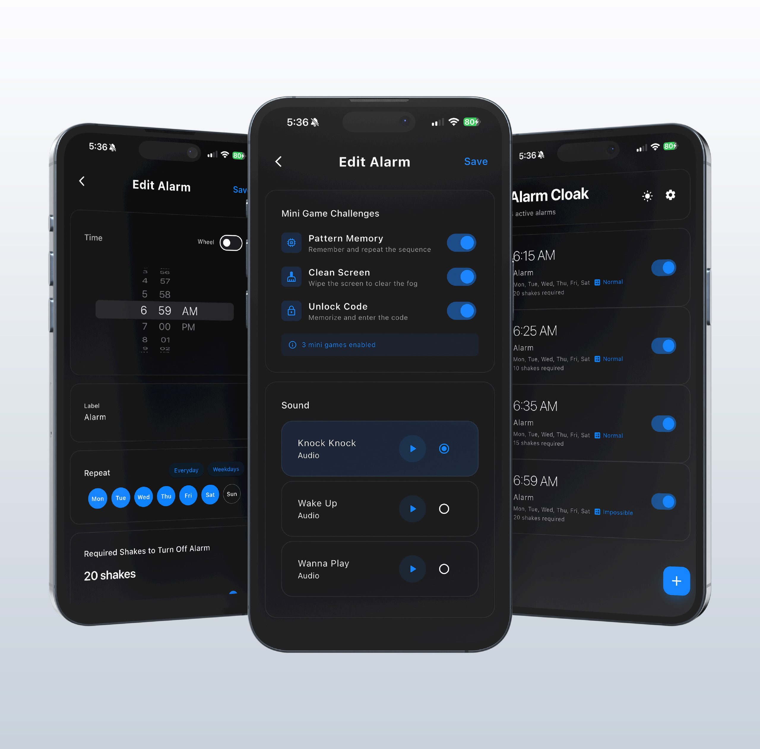
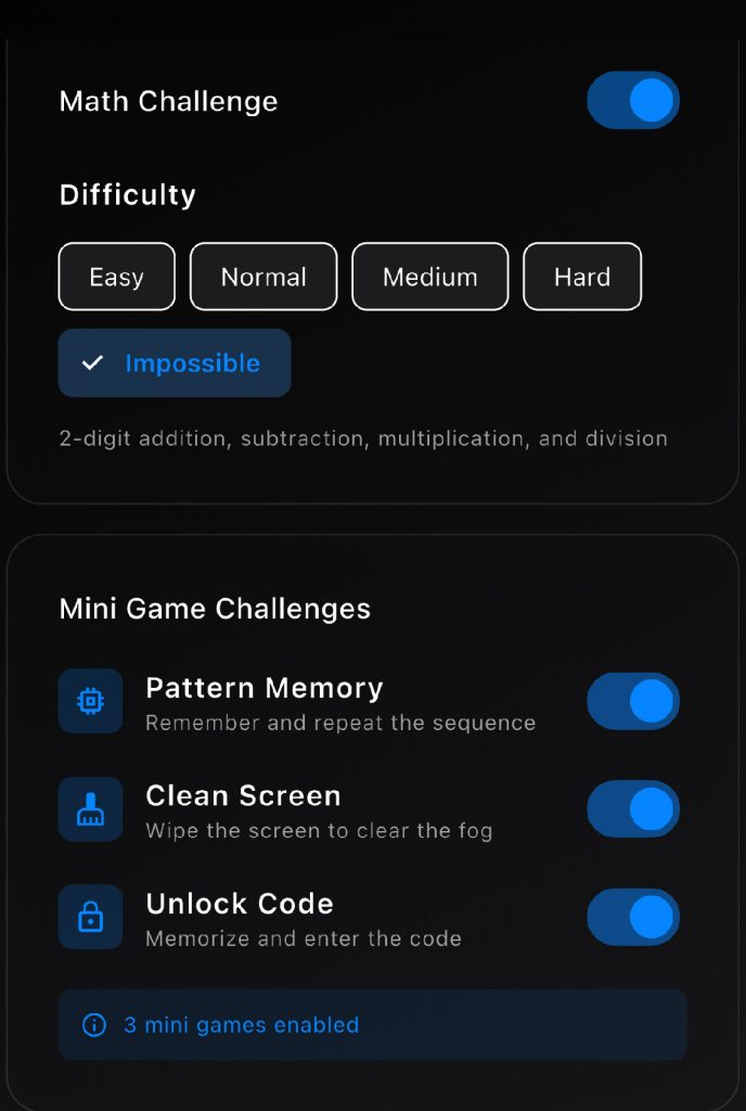
My role:
Personal Project
A gamified alarm app built to strengthen self-discipline and reduce snoozing. Features interactive challenges to dismiss alarms turning wake-ups into wins everyday.
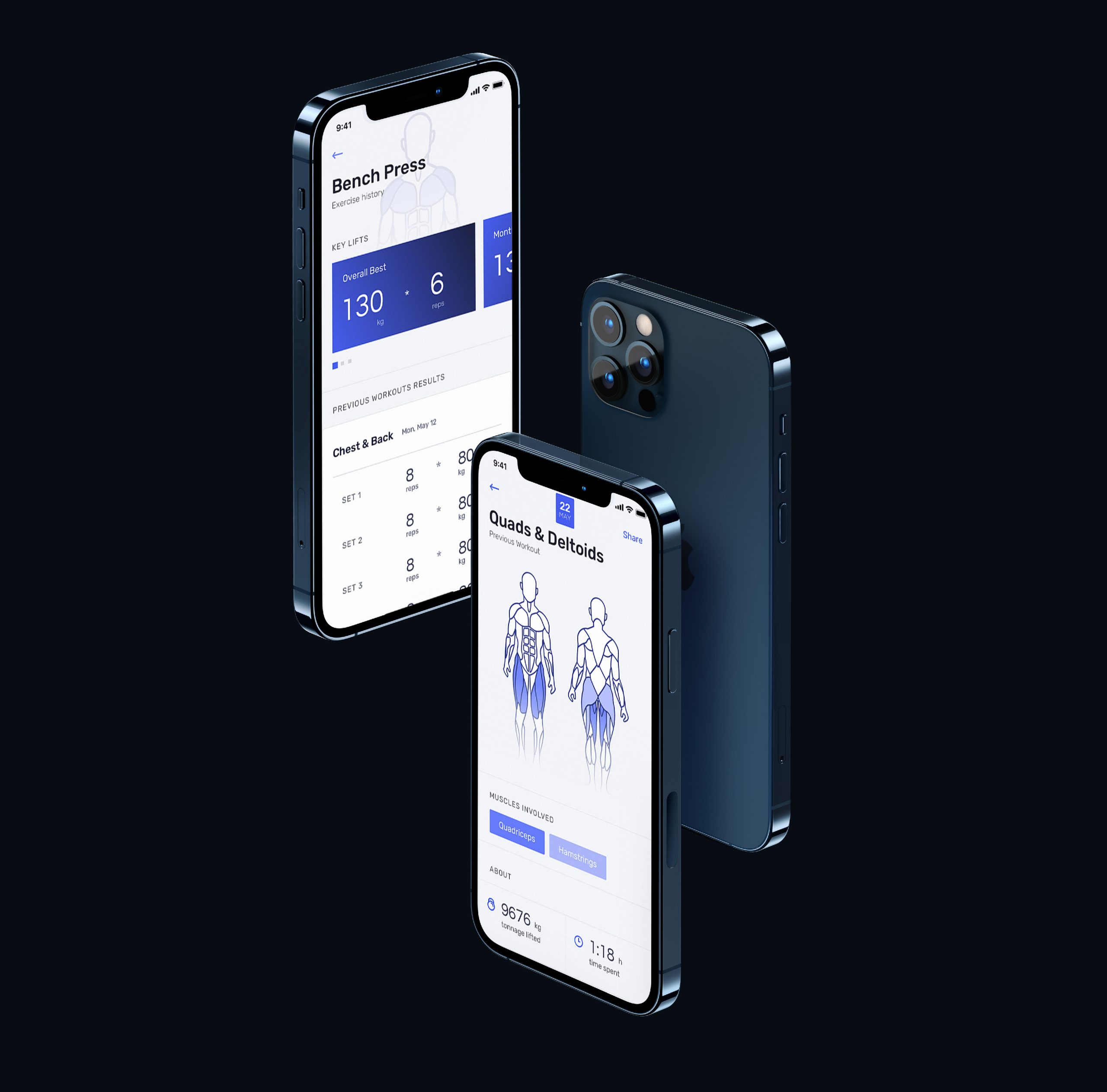
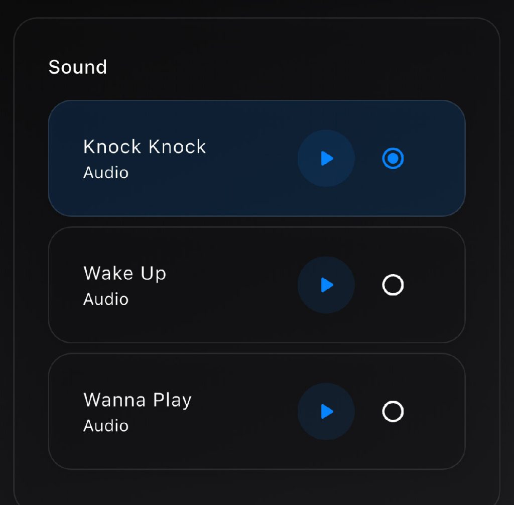
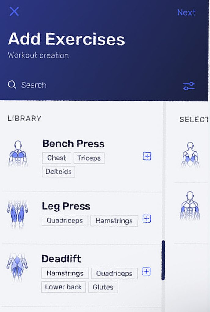
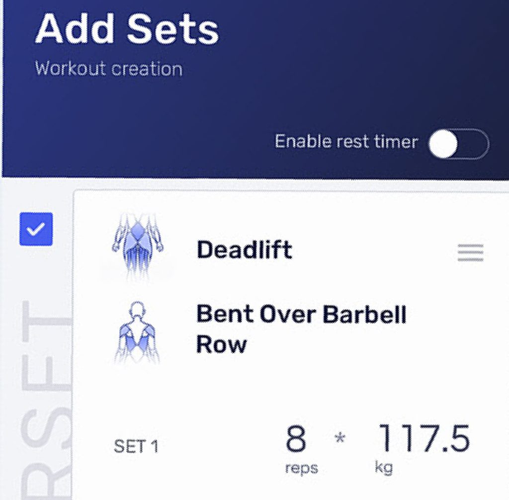
My role:
Personal Project
A self-built fitness app to track workouts, progress, and training methods. Designed with sleek visuals and data-driven insights to support consistency and self-discipline.